Flag Aesthetics
Also, I hate to admit it, but my first reaction on seeing the intersection flag was, “They made the flag ugly.” My friend replied that she thought it was beautiful, and she was right—the idea is beautiful. But the aesthetics? Not so much.
The problem was rolling around in my head on the subway ride home, so I took a shot at improving it:
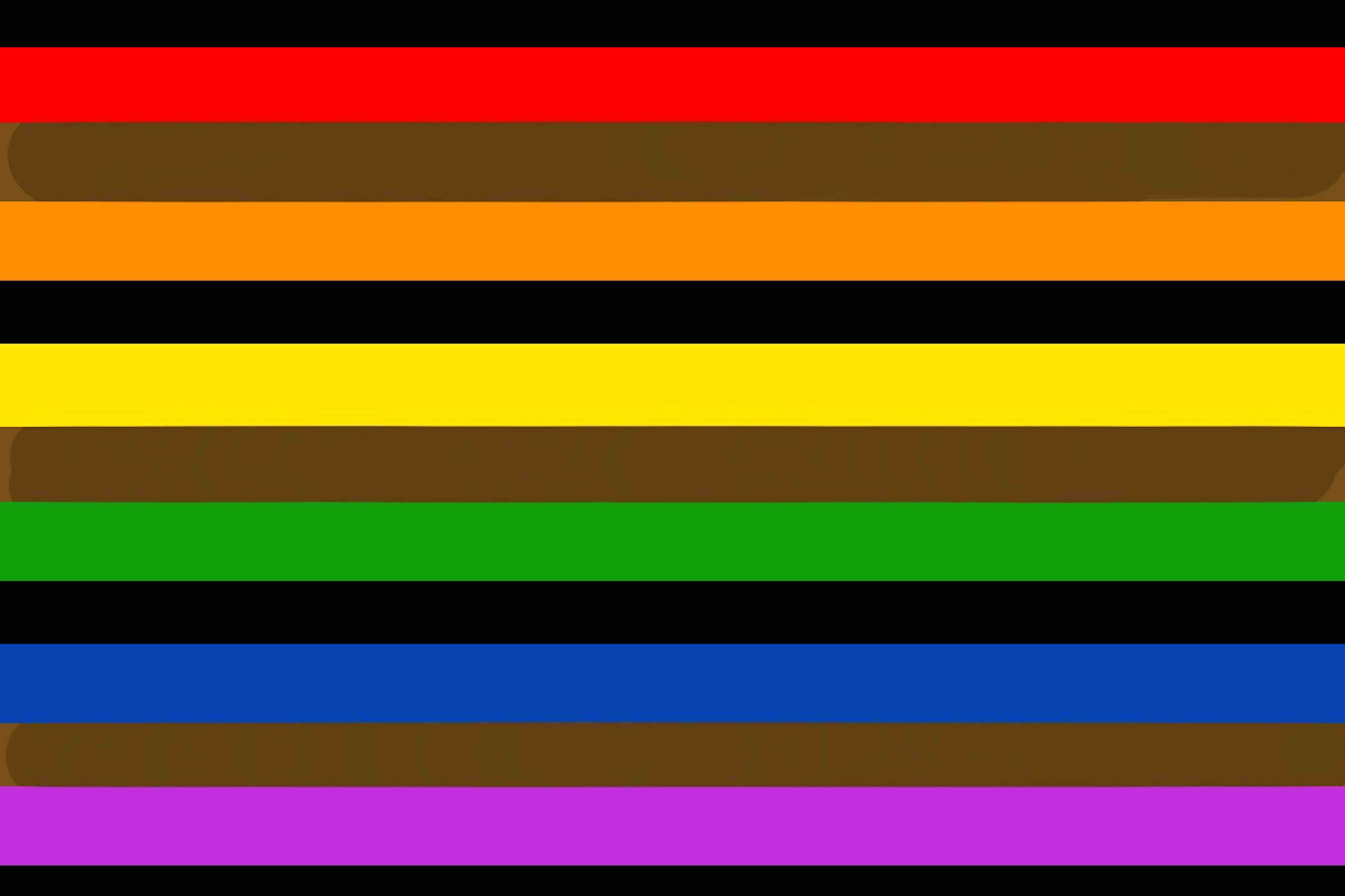
It’s a quick and rough job, so the proportions of the stripes are off. But I do feel like it is an improvement. In the Philadelphia version, the flag feels unbalanced with the black and brown sitting atop the bright rainbow. By interleaving the stripes, the flag becomes more cohesive. I also think the symbolism of this version works better too—POC are within the broader LGBT community/rainbow.